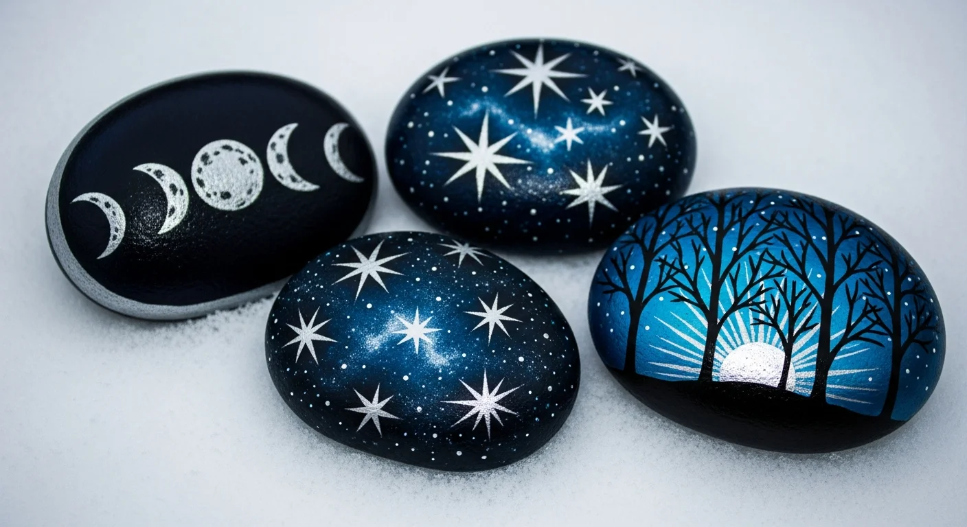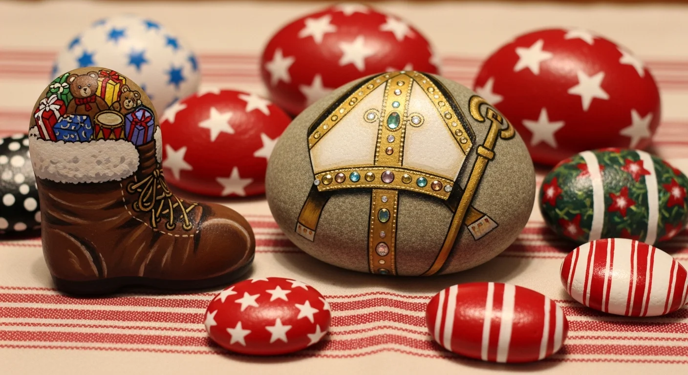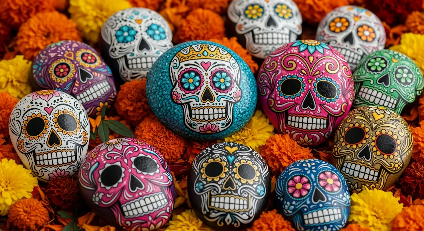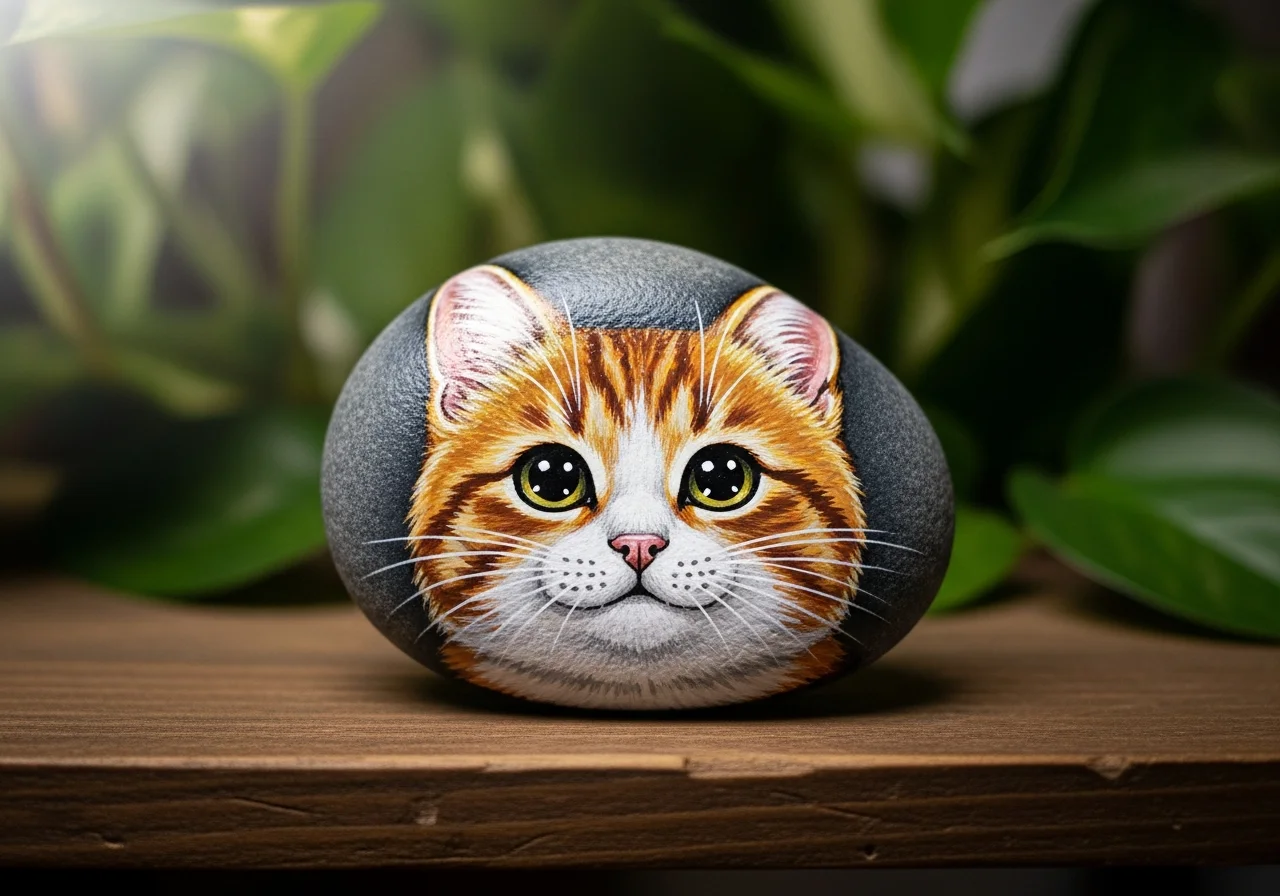

Understanding colour theory is the single biggest leap a rock painter can make in improving their results. It does not require a formal art education - just a handful of concepts that, once understood, transform how you approach every design. The difference between a rock that looks muddy and confused and one that looks vibrant and professionally finished often comes down to colour choices alone.
This guide covers the essential colour theory concepts for rock painters: the colour wheel, complementary and analogous palettes, warm and cool tones, mixing clean secondaries and how to use colour for mood and meaning.
The Colour Wheel: Your Foundation
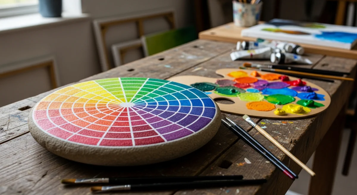
The colour wheel organises colours by their relationships to each other:
- Primary colours - Red, yellow and blue. These cannot be mixed from other colours.
- Secondary colours - Orange (red + yellow), green (yellow + blue), purple (blue + red).
- Tertiary colours - The six colours between primaries and secondaries: red-orange, yellow-orange, yellow-green, blue-green, blue-purple, red-purple.
Colours opposite each other on the wheel are called complementary colours. Colours next to each other are called analogous colours.
Complementary Colours: Maximum Contrast and Vibrance
Complementary colour pairs create the most visually striking combinations:
- Red + Green
- Blue + Orange
- Yellow + Purple
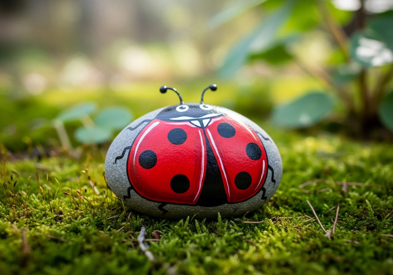
When placed next to each other, complementary colours appear to vibrate - each makes the other look brighter. This is why a red poppy on a dark green rock is so visually powerful, and why blue and gold designs feel so festive.
For rock painting, use complementary colours when you want your design to leap out and command attention.

Analogous Colours: Harmony and Calm
Analogous colours sit next to each other on the colour wheel. Examples:
- Blue, blue-green, green
- Red, red-orange, orange
- Yellow, yellow-green, green
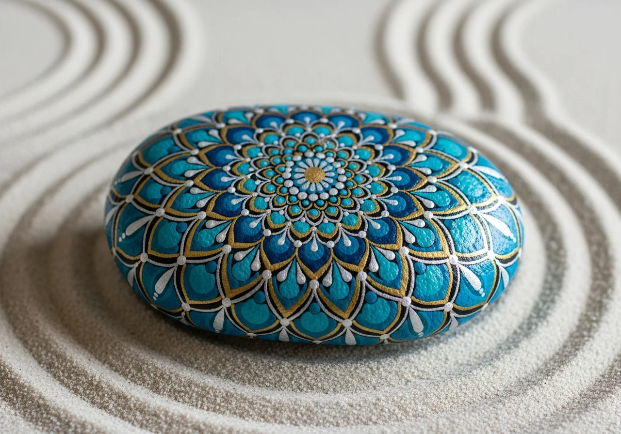
Analogous palettes feel harmonious and restful. Use them for calming, therapeutic rocks, landscape scenes (all the blues and greens of water and sky) and where you want beauty without tension.
Warm vs Cool Colours
Colours are broadly divided into warm (red, orange, yellow) and cool (blue, green, purple) families. Understanding this is essential for rock painting:
- Warm colours advance - They appear to come forward, making them ideal for foreground subjects like flowers, animals or focal design elements.
- Cool colours recede - They appear to go back, making them ideal for backgrounds, sky, shadow and depth effects.
A simple but powerful composition: a warm orange fox in the foreground against a cool blue-grey forest background. The colour temperature difference automatically creates the illusion of depth.
Mixing Clean Secondary and Tertiary Colours
The most common mistake beginners make is mixing colours incorrectly and producing muddy browns and greys. Follow these principles:
- Mix only adjacent colours - Only mix colours that sit next to each other on the colour wheel. Mixing opposite colours (red + green, blue + orange) creates brown.
- Add dark to light - When adding a dark colour to a light one, always add the dark colour to the light, not vice versa. Dark colours overpower quickly.
- Use white to lighten, not yellow - Adding white to a colour creates a tint. Adding yellow shifts the hue.
- Mix neutrals intentionally - For grey, mix black + white. For brown, mix red + yellow + black. For earth tones, mix orange with small amounts of its complement (blue).

Colour for Mood and Meaning
Colours carry emotional associations that are largely universal:
- Red - Energy, passion, love, danger. Use for bold, attention-grabbing designs.
- Blue - Calm, trust, water, sky, sadness. The most universally liked colour globally.
- Yellow - Joy, warmth, sunshine, optimism. Luminous and uplifting.
- Green - Nature, growth, health, balance. Restful to the eye.
- Purple - Luxury, mystery, spirituality, creativity.
- White - Purity, simplicity, peace, beginning.
- Black - Sophistication, depth, mystery, contrast.
Your Personal Rock Painting Palette
Rather than buying 24 colours, start with a limited palette of 6–8 colours that you can mix into a huge range of results:
- Titanium White
- Ivory Black
- Cadmium Red (or Pyrrole Red)
- Cadmium Yellow (or Hansa Yellow)
- Ultramarine Blue
- Phthalo Green
- Burnt Sienna (for earthy neutrals)
- Raw Umber (for warm shadows)
With these 8 colours, you can mix virtually any hue, shade or tint needed for rock painting.
Frequently Asked Questions
Do I need to understand colour theory to enjoy rock painting?
No - many people paint intuitively and beautifully without ever consciously applying colour theory. But if you have ever wondered why some of your rocks look flat or muddy while others glow, colour theory is almost certainly the answer. Even half an hour reading about the colour wheel will transform your results.
Which app can help me create colour palettes for rock painting?
Adobe Color (color.adobe.com) is free and excellent for generating complementary, analogous and triadic palettes. Coolors.co is another popular option. Both allow you to export palettes and save them for reference while painting.